Peer-Reviewed Article · Jul 23, 2014
How to Communicate the Scientific Consensus on Climate Change
Filed under: Messaging
We are pleased to announce a newly published article: “How to Communicate the Scientific Consensus on Climate Change: Plain Facts, Pie Charts or Metaphors?” by Sander van der Linden, Anthony Leiserowitz, Geoffrey Feinberg and Edward W. Maibach in the journal Climatic Change. The article can be downloaded here.
At present, only one in ten (12%) Americans understand that 90% or more climate scientists have concluded that human-caused climate change is happening. Recent research has found that this public misunderstanding about the degree of scientific consensus is highly consequential: public perceptions of the scientific consensus appear to influence public beliefs that global warming is happening, human-caused and a serious problem that requires public action and legislative support. Our new paper offers some practical recommendations on how to effectively communicate the scientific consensus.
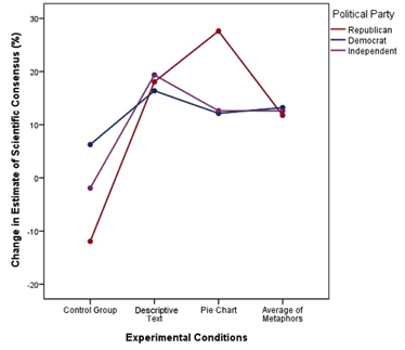
As part of the study, we conducted an experiment testing three popular approaches to communicating the scientific consensus. In the first experimental condition, participants were shown a simple descriptive text message stating that: “97% of climate scientists have concluded that human-caused climate change is happening”. In the second condition, participants were shown a pie chart representing the consensus visually. We also tested a variety of different metaphors to describe the consensus (e.g., “If 97% of doctors concluded that your child is sick, would you believe them? 97% of climate scientists have concluded that human-caused climate change is happening). Participants in the control group did not view any message. Respondents were asked to provide an estimate (0% to 100%) of the degree of scientific consensus on human-caused climate change before (pre) and after (post) viewing the messages.
The experiment found that:
- All three approaches (the descriptive text, pie chart and metaphors) improved public understanding of the degree of scientific consensus;
- Overall, the descriptive text and pie chart were the most effective, increasing consensus-estimates by nearly 20%, with just one exposure;
- The pie chart performed particularly well for all political audiences examined, especially with Republicans.
These results suggest it is possible to improve public understanding of the scientific consensus on climate change in a way that does not trigger political polarization. In particular, our findings suggest that scientists, NGO’s, and policy makers should communicate the scientific consensus using short, simple declarative sentences or simple pie charts. While metaphors can be very useful in conveying complex scientific concepts (like the “greenhouse effect”), for the relatively simple concept of the degree of expert agreement, our results suggest that a short, simple and sticky message is most effective. Ultimately, better communication of the scientific consensus on human-caused climate change can contribute to improved public understanding and engagement with the issue.
The full paper is available for download directly from Climatic Change. Please contact us for a copy if you are unable to download it from the journal directly.