For the Media · February 28, 2017
Americans Support the Clean Power Plan: Majority support in all 50 states and 435 Congressional Districts
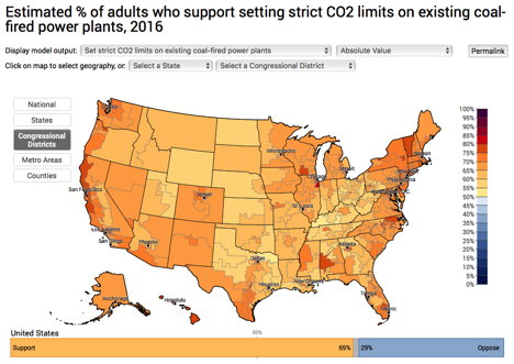
February 28, 2017 – (New Haven, CT) A new study finds that majorities of Americans in all 50 states and all 435 Congressional Districts support setting strict carbon dioxide emissions limits on coal-fired power plants.
“The EPA’s Clean Power Plan is designed to reduce global warming pollution from electric power plants. News reports suggest that President Trump plans to soon sign an executive order rescinding the plan,” said Anthony Leiserowitz, PhD. of Yale University. “Yet setting strict carbon dioxide emission limits on coal-fired power plants is supported by a majority of the constituents of every U.S. Senator and Representative.”
This and many other results are found in a new version of the Yale Climate Opinion Maps (YCOM 2.0), based on a statistical model that estimates public climate change opinion and policy support in all 50 states, 435 Congressional districts, 3,000+ counties, and 916 metro areas across the nation.
YCOM 2.0 reveals the rich geographic diversity of Americans’ opinions about global warming. A new spatial layer – Metro Areas – provides estimates of public opinions in urban areas. Version 2.0 also adds new questions, including trust in climate scientists, the belief that global warming will harm plants and animals, how often Americans discuss global warming with their friends and family, and how often they hear about global warming in the media (available at the state level).
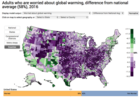
Another new feature is the “Difference Maps” available in a pull-down menu at the top of the tool. Rather than mapping absolute values, the difference maps depict those locations above the national average in shades of green and below the national average in shades of purple. This view makes it easier to see the geographic diversity of opinion across the country. For example, while 58% of all Americans are worried about global warming (the national average), the difference map below illustrates the counties where Americans are more or less worried than average. Some areas might be expected, like the higher than average levels of worry along the West Coast and New England. Others, however, might be surprising, like the band of counties stretching across the Deep South, the Texas/Mexico border, or parts of South Dakota (e.g., the Standing Rock Indian Reservation).
The maps are interactive – visitors can explore the data by clicking and zooming in to any state, congressional district, metro area, or county. The margin of error, however, does increase at smaller geographic scales (i.e., from state to county levels). As a result, it is not possible to know whether a county estimate of 42% is statistically different than an estimate in a nearby county of, say, 44%.
For additional details on the methodology behind the tool and some key findings, please see the published paper: Howe, Peter D., Mildenberger, M., Marlon, J., & Leiserowitz, A. (2015) Geographic variation in opinions on climate change at state and local scales, Nature Climate Change 5, 596-603.
The research was funded by the Skoll Global Threats Fund, the U.S. Energy Foundation, the 11th Hour Project, the Grantham Foundation for the Protection of the Environment, the MacArthur Foundation, the Overlook Foundation, and the Endeavor Foundation.